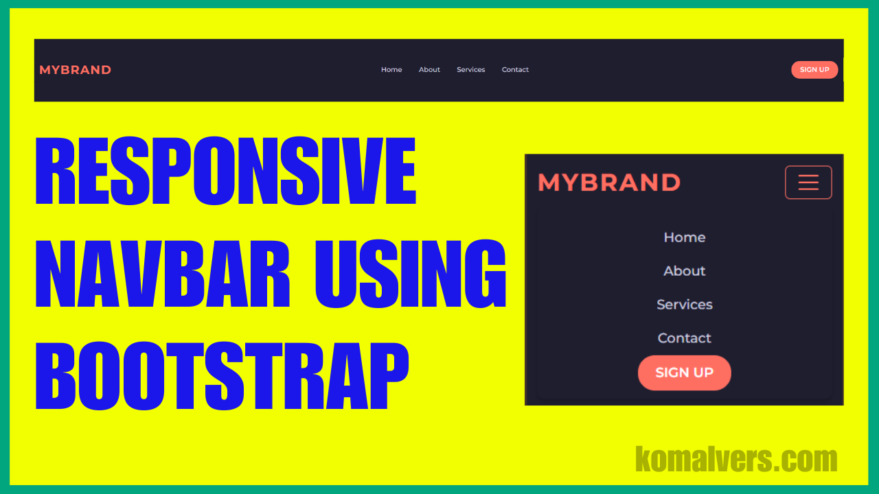
Responsive web design is essential for providing a seamless user experience across devices, and one key component is the navbar. A responsive navbar adapts to different screen sizes, ensuring your navigation menu looks great on both mobile and desktop screens.
In this blog post, we’ll walk through the process of creating a responsive navbar using Bootstrap and CSS. Whether you’re a beginner or an experienced developer, this guide will help you build a modern, mobile-friendly navigation bar for your website.
Step 1: Setting Up Your HTML Structure
First, let’s create the basic HTML structure for our navbar. The following code will create a responsive navigation bar that collapses on smaller screens and displays a hamburger menu.
<!DOCTYPE html>
<html lang="en">
<head>
    <meta charset="UTF-8">
    <meta name="viewport" content="width=device-width, initial-scale=1.0">
    <title>Responsive Navbar</title>
    <!-- Bootstrap CSS -->
    <link href="https://cdn.jsdelivr.net/npm/bootstrap@5.3.0/dist/css/bootstrap.min.css" rel="stylesheet">
</head>
<body>
    <nav class="navbar navbar-expand-lg navbar-dark">
        <div class="container-fluid">
            <a class="navbar-brand" href="#">MyBrand</a>
            <button class="navbar-toggler" type="button" data-bs-toggle="collapse" data-bs-target="#navbarNav" aria-controls="navbarNav" aria-expanded="false" aria-label="Toggle navigation">
                <span class="navbar-toggler-icon"></span>
            </button>
            <div class="collapse navbar-collapse" id="navbarNav">
                <ul class="navbar-nav mx-auto">
                    <li class="nav-item">
                        <a class="nav-link" href="#">Home</a>
                    </li>
                    <li class="nav-item">
                        <a class="nav-link" href="#">About</a>
                    </li>
                    <li class="nav-item">
                        <a class="nav-link" href="#">Services</a>
                    </li>
                    <li class="nav-item">
                        <a class="nav-link" href="#">Contact</a>
                    </li>
                </ul>
                <button class="btn btn-signup">Sign Up</button>
            </div>
        </div>
    </nav>

    <!-- Bootstrap JS -->
    <script src="https://cdn.jsdelivr.net/npm/bootstrap@5.3.0/dist/js/bootstrap.bundle.min.js"></script>
</body>
</html>
Step 2: Adding Custom CSS for Styling
Now, let’s add some custom CSS to style the navbar. This will include setting the background color, adjusting the text color, and adding hover effects. The mobile-first approach ensures that our navbar will work seamlessly on all devices.
/* Navbar styles */
        .navbar {
            background-color: #1e1e2f;
            font-family: 'Montserrat', sans-serif;
            box-shadow: 0 4px 6px rgba(0, 0, 0, 0.1);
        }

        .navbar-brand {
            color: #ff6f61;
            font-size: 1.8rem;
            font-weight: bold;
            text-transform: uppercase;
            letter-spacing: 2px;
        }

        .navbar-brand:hover {
            color: #ffffff;
        }

        .navbar-nav .nav-link {
            color: #d1d1e0;
            margin: 0 12px;
            font-size: 1rem;
            font-weight: 500;
            transition: color 0.3s, transform 0.3s;
        }

        .navbar-nav .nav-link:hover {
            color: #ff6f61;
            transform: scale(1.1);
        }

        .btn-signup {
            background-color: #ff6f61;
            color: #ffffff;
            border-radius: 20px;
            padding: 8px 20px;
            font-weight: 600;
            text-transform: uppercase;
            transition: background-color 0.3s, transform 0.3s;
        }

        .btn-signup:hover {
            background-color: #e85750;
            transform: scale(1.1);
        }

        @media (max-width: 768px) {
            .navbar-collapse {
                background-color: #1e1e2f;
                padding: 10px;
                border-radius: 10px;
                box-shadow: 0 4px 6px rgba(0, 0, 0, 0.2);
            }

            .navbar-nav {
                text-align: center;
                margin-top: 10px;
            }

            .navbar-toggler {
                border-color: #ff6f61;
            }

            .navbar-toggler-icon {
                background-image: url("data:image/svg+xml;charset=utf8,%3Csvg xmlns='http://www.w3.org/2000/svg' viewBox='0 0 30 30'%3E%3Cpath stroke='rgba(255, 111, 97, 1)' stroke-linecap='round' stroke-miterlimit='10' stroke-width='2' d='M4 7h22M4 15h22M4 23h22'/%3E%3C/svg%3E");
            }
        }
Step 3: Explanation of Code
1. HTML Structure
We used Bootstrap’s navbar component to create the structure. The navbar-toggler button is added to toggle the navbar on small screens. The collapse class ensures that the menu collapses on mobile.
2. CSS Styling
We applied custom colors, fonts, and hover effects to the navbar. The @media query ensures that the navbar is responsive and adapts to different screen sizes, especially for mobile users.
Conclusion
In this tutorial, you’ve learned how to create a responsive navbar using Bootstrap and CSS. Now, your website will have a sleek, modern navbar that looks great on any device. This is a fundamental skill for web developers, and mastering it will help you create better user interfaces for your websites.
FAQ
Why is my navbar not showing on mobile?
Ensure that the navbar-toggler button and collapse class are correctly applied.
Can I use this navbar in WordPress?
Yes, you can integrate this navbar into your WordPress theme by copying the HTML and CSS into your theme files.
How do I make my navbar sticky?
To make your navbar sticky at the top of the page as users scroll, you can add the class sticky-top to your Bootstrap navbar. This will keep the navbar fixed at the top, improving the user experience for websites with long content.
<nav class="navbar navbar-expand-lg navbar-dark sticky-top">
    <!-- Navbar content -->
</nav>