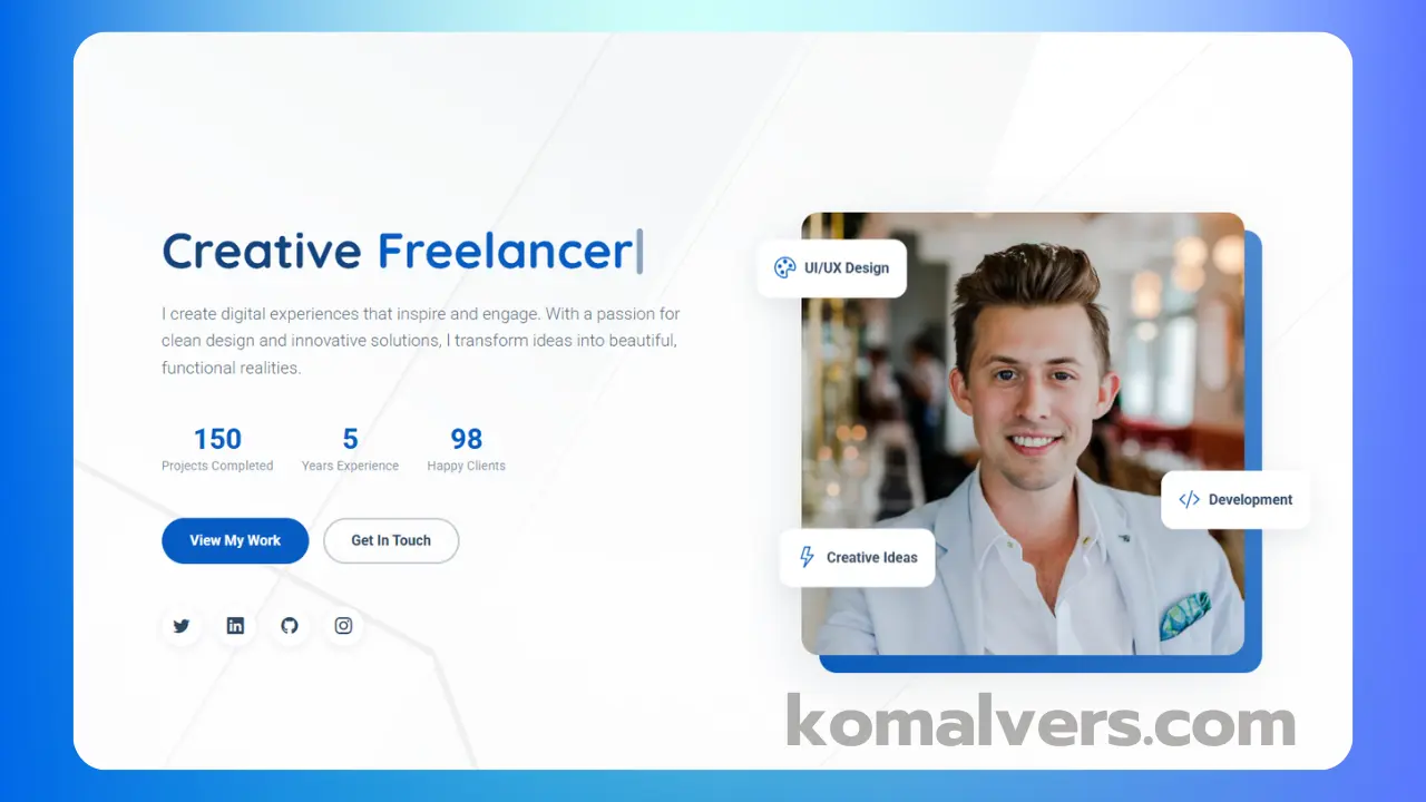
Building a responsive portfolio website can be a great way to showcase your skills and attract potential employers or clients. In this post, I’ll walk you through the process of creating a stunning portfolio website using HTML, CSS, JavaScript, and Bootstrap. The site is fully responsive, ensuring it looks great on both desktop and mobile devices. Below, you’ll find the source code and a step-by-step guide to building the site. Let’s dive in!
Tools and Technologies Used
To build this responsive portfolio website, we used the following technologies:
- HTML: The structure of the website was built using HTML. It gives the website its basic layout and organizes the content.
- CSS: We used CSS to make the design visually appealing, creating styles for the layout, fonts, colors, and spacing.
- JavaScript: JavaScript added interactivity to the site, including features like dynamic content loading, form validation, and more.
- Bootstrap: Bootstrap was used to ensure the website is responsive. It makes sure the website looks great across different screen sizes, from mobile devices to large desktops.
Step-by-Step Guide
Now let’s break down the steps involved in creating the portfolio website. The key features of this website include:
- Responsive navigation bar: A navigation bar that adjusts itself to different screen sizes.
- Hero section: A large hero image with a welcoming message and a call-to-action button.
- Service section: A section showcasing the services you offer, displayed with icons and short descriptions.
- Portfolio project section: A gallery of your projects with images and links to details about each one.
- Testimonial and review section: A section displaying client or user feedback with a carousel for easy navigation.
- Contact form: A simple, easy-to-use contact form that potential clients or employers can use to reach out.
- Modal popup alert form: A form that pops up when a button is clicked, allowing users to interact without navigating away from the page.
- Mobile-first design with Bootstrap: Using Bootstrap, we ensured that the website is mobile-friendly and adapts to various screen sizes, giving users the best experience regardless of the device.
You can also watch my full tutorial on YouTube for an in-depth walkthrough of the project:
Source Code
Here’s the full source code for the portfolio website:
HTML Code
<!DOCTYPE html>
<html lang="en">
<head>
<meta charset="UTF-8">
<meta name="viewport" content="width=device-width, initial-scale=1.0">
<title>Portfolio | UI/UX Designer</title>
<!-- Bootstrap CSS -->
<link href="https://cdn.jsdelivr.net/npm/bootstrap@5.3.0/dist/css/bootstrap.min.css" rel="stylesheet">
<!-- Google Fonts - Poppins -->
<link href="https://fonts.googleapis.com/css2?family=Poppins:wght@300;400;500;600;700&display=swap" rel="stylesheet">
<!-- Font Awesome -->
<link rel="stylesheet" href="https://cdnjs.cloudflare.com/ajax/libs/font-awesome/6.0.0/css/all.min.css">
<!-- AOS CSS -->
<link href="https://unpkg.com/aos@2.3.1/dist/aos.css" rel="stylesheet">
<!-- Custom CSS -->
<link rel="stylesheet" href="css/style.css">
<style>
body {
background-color: #f5f5f5;
}
</style>
</head>
<body>
<!-- Shapes -->
<div class="shape shape-1"></div>
<div class="shape shape-2"></div>
<div class="shape shape-3"></div>
<!-- Navbar -->
<nav class="navbar navbar-expand-lg fixed-top">
<div class="container">
<a class="navbar-brand" href="#">UI Wonders</a>
<button class="navbar-toggler" type="button" data-bs-toggle="collapse" data-bs-target="#navbarNav">
<span class="navbar-toggler-icon"></span>
</button>
<div class="collapse navbar-collapse" id="navbarNav">
<ul class="navbar-nav ms-auto">
<li class="nav-item"><a class="nav-link" href="#home">Home</a></li>
<li class="nav-item"><a class="nav-link" href="#services">Services</a></li>
<li class="nav-item"><a class="nav-link" href="#portfolio">Portfolio</a></li>
<li class="nav-item"><a class="nav-link" href="#testimonial">Testimonial</a></li>
<li class="nav-item"><a class="nav-link" href="#contact">Contact</a></li>
</ul>
</div>
</div>
</nav>
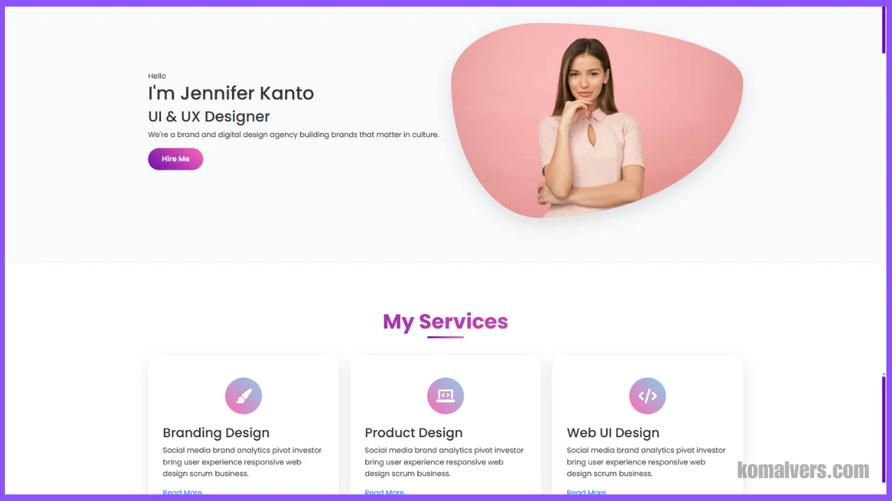
<!-- Hero Section -->
<section id="home" class="hero-section">
<div class="container">
<div class="row align-items-center">
<div class="col-lg-6" data-aos="fade-right">
<span class="subtitle">Hello</span>
<h1>I'm <span class="highlight">Jennifer</span> Kanto</h1>
<h2>UI & UX Designer</h2>
<p class="description">We're a brand and digital design agency building brands that matter in culture.</p>
<div class="cta-buttons">
<button class="btn btn-primary" data-bs-toggle="modal" data-bs-target="#hireModal">Hire Me</button>
</div>
</div>
<div class="col-lg-6 text-center" data-aos="fade-left">
<div class="hero-image">
<img src="images/profile.jpg" alt="Designer Profile" class="img-fluid">
</div>
</div>
</div>
</div>
</section>
<!-- Services Section -->
<section id="services" class="services-section">
<div class="container">
<h2 class="section-title text-center" data-aos="fade-up">My Services</h2>
<div class="row">
<div class="col-lg-4" data-aos="fade-up" data-aos-delay="100">
<div class="service-card">
<div class="icon">
<i class="fas fa-paint-brush"></i>
</div>
<h3>Branding Design</h3>
<p>Social media brand analytics pivot investor bring user experience responsive web design scrum business.</p>
<a href="#" class="read-more">Read More</a>
</div>
</div>
<div class="col-lg-4" data-aos="fade-up" data-aos-delay="200">
<div class="service-card">
<div class="icon">
<i class="fas fa-laptop-code"></i>
</div>
<h3>Product Design</h3>
<p>Social media brand analytics pivot investor bring user experience responsive web design scrum business.</p>
<a href="#" class="read-more">Read More</a>
</div>
</div>
<div class="col-lg-4" data-aos="fade-up" data-aos-delay="300">
<div class="service-card">
<div class="icon">
<i class="fas fa-code"></i>
</div>
<h3>Web UI Design</h3>
<p>Social media brand analytics pivot investor bring user experience responsive web design scrum business.</p>
<a href="#" class="read-more">Read More</a>
</div>
</div>
</div>
</div>
</section>
<!-- Portfolio Section -->
<section id="portfolio" class="portfolio-section">
<div class="container">
<h2 class="section-title text-center" data-aos="fade-up">Latest Projects</h2>
<div class="row g-4">
<div class="col-md-4" data-aos="fade-up" data-aos-delay="100">
<div class="portfolio-card">
<div class="portfolio-img">
<img src="images/project1.jpg" alt="Project 1" class="img-fluid">
</div>
<div class="portfolio-content">
<h3>Web Design Landing Page</h3>
<p>UI/UX Design</p>
</div>
</div>
</div>
<div class="col-md-4" data-aos="fade-up" data-aos-delay="200">
<div class="portfolio-card">
<div class="portfolio-img">
<img src="images/project2.jpg" alt="Project 2" class="img-fluid">
</div>
<div class="portfolio-content">
<h3>Mobile App Design</h3>
<p>Product Design</p>
</div>
</div>
</div>
<div class="col-md-4" data-aos="fade-up" data-aos-delay="300">
<div class="portfolio-card">
<div class="portfolio-img">
<img src="images/project3.jpg" alt="Project 3" class="img-fluid">
</div>
<div class="portfolio-content">
<h3>E-commerce Landing Page</h3>
<p>Web Development</p>
</div>
</div>
</div>
</div>
</div>
</section>
<!-- Skills Section -->
<section id="skills" class="skills-section">
<div class="container">
<h2 class="section-title text-center" data-aos="fade-up">My Skills</h2>
<div class="row">
<div class="col-md-6" data-aos="fade-right">
<div class="skill-item">
<div class="skill-info">
<h3>UI Design</h3>
<span>90%</span>
</div>
<div class="progress">
<div class="progress-bar" role="progressbar" style="width: 90%" aria-valuenow="90" aria-valuemin="0" aria-valuemax="100"></div>
</div>
</div>
<div class="skill-item">
<div class="skill-info">
<h3>Web Design</h3>
<span>85%</span>
</div>
<div class="progress">
<div class="progress-bar" role="progressbar" style="width: 85%" aria-valuenow="85" aria-valuemin="0" aria-valuemax="100"></div>
</div>
</div>
</div>
<div class="col-md-6" data-aos="fade-left">
<div class="skill-item">
<div class="skill-info">
<h3>Product Design</h3>
<span>95%</span>
</div>
<div class="progress">
<div class="progress-bar" role="progressbar" style="width: 95%" aria-valuenow="95" aria-valuemin="0" aria-valuemax="100"></div>
</div>
</div>
<div class="skill-item">
<div class="skill-info">
<h3>Branding</h3>
<span>80%</span>
</div>
<div class="progress">
<div class="progress-bar" role="progressbar" style="width: 80%" aria-valuenow="80" aria-valuemin="0" aria-valuemax="100"></div>
</div>
</div>
</div>
</div>
</div>
</section>
<!-- Testimonial Section -->
<section id="testimonial" class="testimonial-section">
<div class="container">
<h2 class="section-title text-center" data-aos="fade-up">Happy Clients Say</h2>
<div class="row">
<div class="col-md-6" data-aos="fade-right">
<div class="testimonial-card">
<div class="testimonial-content">
<p>"Lorem ipsum dolor sit amet, consectetur adipiscing elit. Ut elit tellus, luctus nec ullamcorper mattis."</p>
</div>
<div class="testimonial-author">
<i class="fas fa-user-circle fa-3x me-3"></i>
<div class="author-info">
<h4>Michael Smith</h4>
<p>CEO, Tech Co</p>
</div>
</div>
</div>
</div>
<div class="col-md-6" data-aos="fade-left">
<div class="testimonial-card">
<div class="testimonial-content">
<p>"Duis aute irure dolor in reprehenderit in voluptate velit esse cillum dolore eu fugiat nulla pariatur."</p>
</div>
<div class="testimonial-author">
<i class="fas fa-user-circle fa-3x me-3"></i>
<div class="author-info">
<h4>Sarah Johnson</h4>
<p>Designer, Design Studio</p>
</div>
</div>
</div>
</div>
</div>
</div>
</section>
<!-- Contact Section -->
<section id="contact" class="contact-section">
<div class="container">
<h2 class="section-title text-center" data-aos="fade-up">Have Any Project in Mind?</h2>
<div class="row justify-content-center">
<div class="col-md-8" data-aos="fade-up">
<form class="contact-form">
<div class="row">
<div class="col-md-6">
<input type="text" class="form-control" placeholder="Your Name">
</div>
<div class="col-md-6">
<input type="email" class="form-control" placeholder="Your Email">
</div>
</div>
<textarea class="form-control" rows="5" placeholder="Your Message"></textarea>
<button type="submit" class="btn btn-primary">Send Message</button>
</form>
</div>
</div>
</div>
</section>
<!-- Modal -->
<div class="modal fade" id="hireModal" tabindex="-1" aria-hidden="true">
<div class="modal-dialog modal-dialog-centered">
<div class="modal-content">
<div class="modal-header">
<h5 class="modal-title">Get Started</h5>
<button type="button" class="btn-close" data-bs-dismiss="modal" aria-label="Close"></button>
</div>
<div class="modal-body">
<form class="hire-form">
<div class="mb-3">
<input type="text" class="form-control" placeholder="Your Name" required>
</div>
<div class="mb-3">
<input type="email" class="form-control" placeholder="Your Email" required>
</div>
<div class="mb-3">
<select class="form-control" required>
<option value="">Select Service</option>
<option value="web-design">Web Design</option>
<option value="ui-design">UI Design</option>
<option value="branding">Branding</option>
</select>
</div>
<div class="mb-3">
<textarea class="form-control" rows="4" placeholder="Project Details" required></textarea>
</div>
<button type="submit" class="btn btn-primary w-100">Get Quotation</button>
</form>
</div>
</div>
</div>
</div>
<!-- Footer -->
<footer class="footer">
<div class="container">
<div class="row">
<div class="col-md-6">
<p>&copy; 2025 UI Wonders. All rights reserved.</p>
</div>
<div class="col-md-6">
<div class="social-links">
<a href="#"><i class="fab fa-facebook-f"></i></a>
<a href="#"><i class="fab fa-twitter"></i></a>
<a href="#"><i class="fab fa-instagram"></i></a>
<a href="#"><i class="fab fa-linkedin-in"></i></a>
</div>
</div>
</div>
</div>
</footer>
<!-- Scripts -->
<script src="https://cdn.jsdelivr.net/npm/bootstrap@5.3.0/dist/js/bootstrap.bundle.min.js"></script>
<script src="https://unpkg.com/aos@2.3.1/dist/aos.js"></script>
<script src="js/main.js"></script>
</body>
</html>
CSS Code
/* Global Styles */
:root {
    --color-primary: #6a0dad;
    --color-secondary: #ff69b4;
    --color-accent: #87ceeb;
    --color-dark: #333333;
    --color-light: #ffffff;
    --color-gray: #f8f9fa;
    --gradient-primary: linear-gradient(45deg, var(--color-primary), var(--color-secondary));
    --gradient-secondary: linear-gradient(45deg, var(--color-secondary), var(--color-accent));
    --gradient-accent: linear-gradient(45deg, var(--color-accent), var(--color-primary));
}

* {
    margin: 0;
    padding: 0;
    box-sizing: border-box;
}

body {
    font-family: 'Poppins', sans-serif;
    background-color: var(--color-light);
    color: var(--color-dark);
    line-height: 1.6;
    overflow-x: hidden;
}

.section-title {
    font-size: 2.8rem;
    font-weight: 800;
    margin-bottom: 3rem;
    background: var(--gradient-primary);
    -webkit-background-clip: text;
    -webkit-text-fill-color: transparent;
    text-align: center;
    position: relative;
}

.section-title::after {
    content: '';
    position: absolute;
    bottom: -10px;
    left: 50%;
    transform: translateX(-50%);
    width: 80px;
    height: 4px;
    background: var(--gradient-primary);
    border-radius: 2px;
}

/* Buttons */
.btn {
    padding: 12px 30px;
    border-radius: 30px;
    font-weight: 600;
    transition: all 0.4s ease;
    position: relative;
    overflow: hidden;
    z-index: 1;
}

.btn::before {
    content: '';
    position: absolute;
    top: 0;
    left: 0;
    width: 0;
    height: 100%;
    background: var(--gradient-secondary);
    transition: all 0.4s ease;
    z-index: -1;
}

.btn:hover::before {
    width: 100%;
}

.btn-primary {
    background: var(--gradient-primary);
    border: none;
    color: var(--color-light);
}

.btn-primary:hover {
    transform: translateY(-3px);
    box-shadow: 0 10px 20px rgba(0, 0, 0, 0.2);
}

/* Hero Section */
.hero-section {
    padding: 180px 0 100px;
    position: relative;
    overflow: hidden;
    background: var(--color-gray);
}

.hero-content h1 {
    font-size: 4rem;
    font-weight: 800;
    margin-bottom: 1.5rem;
    opacity: 0;
    transform: translateY(30px);
    animation: fadeInUp 0.8s ease forwards;
}

.hero-content p {
    font-size: 1.2rem;
    margin-bottom: 2rem;
    opacity: 0;
    transform: translateY(30px);
    animation: fadeInUp 0.8s ease forwards 0.2s;
}

.hero-image {
    position: relative;
    opacity: 0;
    transform: translateX(30px);
    animation: fadeInRight 0.8s ease forwards 0.4s;
}

.hero-image img {
    border-radius: 30% 70% 70% 30% / 30% 30% 70% 70%;
    box-shadow: 0 15px 30px rgba(0, 0, 0, 0.1);
    transition: all 0.5s ease;
}

.hero-image:hover img {
    transform: scale(1.05);
    border-radius: 50%;
}

/* Services Section */
.services-section {
    padding: 100px 0;
    background: var(--color-light);
}

.service-card {
    background: var(--color-light);
    padding: 3rem 2rem;
    border-radius: 20px;
    box-shadow: 0 10px 30px rgba(0, 0, 0, 0.1);
    transition: all 0.5s ease;
    height: 100%;
    position: relative;
    overflow: hidden;
    z-index: 1;
}

.service-card::before {
    content: '';
    position: absolute;
    top: 0;
    left: 0;
    width: 100%;
    height: 100%;
    background: var(--gradient-primary);
    opacity: 0;
    transition: all 0.5s ease;
    z-index: -1;
}

.service-card:hover {
    transform: translateY(-15px);
}

.service-card:hover::before {
    opacity: 1;
}

.service-card:hover * {
    color: var(--color-light);
}

.service-card .icon {
    width: 80px;
    height: 80px;
    margin: 0 auto 1.5rem;
    display: flex;
    align-items: center;
    justify-content: center;
    border-radius: 50%;
    background: var(--gradient-secondary);
    color: var(--color-light);
    font-size: 2rem;
    transition: all 0.5s ease;
}

.service-card:hover .icon {
    background: var(--color-light);
    color: var(--color-primary);
}

/* Skills Section */
.skills-section {
    padding: 100px 0;
    background: var(--color-gray);
}

.skill-item {
    margin-bottom: 2.5rem;
}

.skill-info {
    display: flex;
    justify-content: space-between;
    margin-bottom: 1rem;
}

.skill-info h3 {
    font-weight: 600;
}

.progress {
    height: 10px;
    background: rgba(0, 0, 0, 0.1);
    border-radius: 10px;
    overflow: hidden;
    position: relative;
}

.progress-bar {
    background: var(--gradient-primary);
    position: relative;
    transition: width 1.5s cubic-bezier(0.1, 0.45, 0.1, 1);
}

.progress-bar::after {
    content: '';
    position: absolute;
    top: 0;
    right: 0;
    width: 5px;
    height: 100%;
    background: var(--color-light);
    animation: pulse 2s infinite;
}

/* Portfolio Section */
.portfolio-section {
    padding: 100px 0;
    background: var(--color-light);
}

.portfolio-card {
    border-radius: 20px;
    overflow: hidden;
    box-shadow: 0 10px 30px rgba(0, 0, 0, 0.1);
    transition: all 0.5s ease;
    position: relative;
}

.portfolio-card:hover {
    transform: translateY(-10px);
}

.portfolio-img {
    position: relative;
    overflow: hidden;
}

.portfolio-img::after {
    content: '';
    position: absolute;
    top: 0;
    left: 0;
    width: 100%;
    height: 100%;
    background: var(--gradient-primary);
    opacity: 0;
    transition: all 0.5s ease;
}

.portfolio-card:hover .portfolio-img::after {
    opacity: 0.8;
}

.portfolio-content {
    position: absolute;
    bottom: -100px;
    left: 0;
    width: 100%;
    padding: 2rem;
    background: rgba(255, 255, 255, 0.9);
    transition: all 0.5s ease;
}

.portfolio-card:hover .portfolio-content {
    bottom: 0;
}

/* Testimonial Section */
.testimonial-section {
    padding: 100px 0;
    background: var(--color-gray);
}

.testimonial-card {
    background: var(--color-light);
    padding: 3rem;
    border-radius: 20px;
    box-shadow: 0 10px 30px rgba(0, 0, 0, 0.1);
    transition: all 0.5s ease;
    position: relative;
}

.testimonial-card::before {
    content: '"';
    position: absolute;
    top: 20px;
    left: 20px;
    font-size: 5rem;
    color: var(--color-primary);
    opacity: 0.1;
}

.testimonial-card:hover {
    transform: translateY(-10px);
}

/* Contact Section */
.contact-section {
    padding: 100px 0;
    background: var(--color-light);
}

.contact-form {
    background: var(--color-light);
    padding: 3rem;
    border-radius: 20px;
    box-shadow: 0 10px 30px rgba(0, 0, 0, 0.1);
}

.form-control {
    padding: 1rem;
    border: 2px solid #eee;
    border-radius: 10px;
    transition: all 0.3s ease;
}

.form-control:focus {
    border-color: var(--color-primary);
    box-shadow: none;
}

/* Modal */
.modal-content {
    border-radius: 20px;
    overflow: hidden;
}

.modal-header {
    background: var(--gradient-primary);
    color: var(--color-light);
    border: none;
}

.modal-body {
    padding: 2rem;
}

/* Custom Scrollbar */
::-webkit-scrollbar {
    width: 12px;
}

::-webkit-scrollbar-track {
    background: var(--color-light);
    border-radius: 10px;
}

::-webkit-scrollbar-thumb {
    background: var(--gradient-primary);
    border-radius: 10px;
    border: 3px solid var(--color-light);
}

::-webkit-scrollbar-thumb:hover {
    background: var(--gradient-secondary);
}

/* Firefox */
* {
    scrollbar-width: thin;
    scrollbar-color: var(--color-primary) var(--color-light);
}

/* Animations */
@keyframes fadeInUp {
    to {
        opacity: 1;
        transform: translateY(0);
    }
}

@keyframes fadeInRight {
    to {
        opacity: 1;
        transform: translateX(0);
    }
}

@keyframes pulse {
    0% { opacity: 1; }
    50% { opacity: 0.5; }
    100% { opacity: 1; }
}

/* Responsive Styles */
@media (max-width: 991px) {
    .hero-section {
        text-align: center;
        padding: 120px 0 60px;
    }

    .hero-content h1 {
        font-size: 3rem;
    }

    .service-card {
        margin-bottom: 2rem;
    }
}
JavaScript Code
// Initialize AOS
AOS.init({
    duration: 1000,
    once: true,
    offset: 100
});

// Navbar scroll effect
const navbar = document.querySelector('.navbar');
window.addEventListener('scroll', function() {
    if (window.scrollY > 50) {
        navbar.classList.add('navbar-scrolled');
    } else {
        navbar.classList.remove('navbar-scrolled');
    }
});

// Animate skill bars when in viewport
const animateSkills = () => {
    const skillBars = document.querySelectorAll('.progress-bar');
    skillBars.forEach(bar => {
        const value = bar.getAttribute('aria-valuenow');
        bar.style.width = '0%';
        setTimeout(() => {
            bar.style.width = value + '%';
        }, 200);
    });
};

// Check if element is in viewport
const isInViewport = (element) => {
    const rect = element.getBoundingClientRect();
    return (
        rect.top >= 0 &&
        rect.left >= 0 &&
        rect.bottom <= (window.innerHeight || document.documentElement.clientHeight) &&
        rect.right <= (window.innerWidth || document.documentElement.clientWidth)
    );
};

// Animate skills when scrolling into view
let skillsAnimated = false;
window.addEventListener('scroll', () => {
    const skillsSection = document.querySelector('.skills-section');
    if (skillsSection && isInViewport(skillsSection) && !skillsAnimated) {
        animateSkills();
        skillsAnimated = true;
    }
});

// Service card hover effect
document.querySelectorAll('.service-card').forEach(card => {
    card.addEventListener('mouseenter', function() {
        this.style.transform = 'translateY(-15px)';
    });
    card.addEventListener('mouseleave', function() {
        this.style.transform = 'translateY(0)';
    });
});

// Portfolio hover effect
document.querySelectorAll('.portfolio-card').forEach(card => {
    card.addEventListener('mouseenter', function() {
        const content = this.querySelector('.portfolio-content');
        content.style.transform = 'translateY(0)';
        content.style.opacity = '1';
    });
    card.addEventListener('mouseleave', function() {
        const content = this.querySelector('.portfolio-content');
        content.style.transform = 'translateY(100%)';
        content.style.opacity = '0';
    });
});

// Handle hire form submission
document.querySelector('.hire-form')?.addEventListener('submit', function(e) {
    e.preventDefault();
    const formData = new FormData(this);
    const data = Object.fromEntries(formData);

    // Show success message
    const modal = document.querySelector('#hireModal');
    const modalBody = modal.querySelector('.modal-body');
    modalBody.innerHTML = `
        <div class="text-center">
            <i class="fas fa-check-circle text-success" style="font-size: 4rem;"></i>
            <h4 class="mt-3">Thank You!</h4>
            <p>Your request has been submitted successfully. I'll get back to you soon!</p>
            <button class="btn btn-primary mt-3" data-bs-dismiss="modal">Close</button>
        </div>
    `;
});

// Smooth scroll for navigation links
document.querySelectorAll('a[href^="#"]').forEach(anchor => {
    anchor.addEventListener('click', function(e) {
        e.preventDefault();
        const target = document.querySelector(this.getAttribute('href'));
        if (target) {
            window.scrollTo({
                top: target.offsetTop - 80,
                behavior: 'smooth'
            });
        }
    });
});

// Text animation for hero section
const animateText = () => {
    const text = document.querySelector('.hero-content h1');
    if (!text) return;

    const content = text.textContent;
    text.textContent = '';

    [...content].forEach((char, index) => {
        const span = document.createElement('span');
        span.textContent = char;
        span.style.opacity = '0';
        span.style.transform = 'translateY(20px)';
        span.style.display = 'inline-block';
        span.style.transition = `all 0.3s ease ${index * 0.05}s`;
        text.appendChild(span);

        setTimeout(() => {
            span.style.opacity = '1';
            span.style.transform = 'translateY(0)';
        }, 100);
    });
};

// Initialize animations
document.addEventListener('DOMContentLoaded', () => {
    animateText();

    // Initialize tooltips
    const tooltipTriggerList = [].slice.call(document.querySelectorAll('[data-bs-toggle="tooltip"]'));
    tooltipTriggerList.map(function (tooltipTriggerEl) {
        return new bootstrap.Tooltip(tooltipTriggerEl);
    });
});
Conclusion
End with a call-to-action, encouraging readers to explore the code and watch the full tutorial. Remind them to like, comment, and subscribe to your YouTube channel.