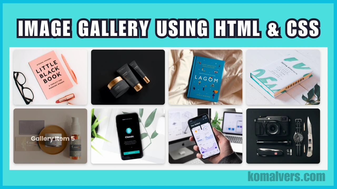
Creating a responsive image gallery with HTML and CSS is a great way to enhance your website’s design without relying on JavaScript. In this tutorial, we’ll walk you through the steps to build a beautiful, mobile-friendly photo gallery that adapts to any screen size.
Key Features of This Image Gallery
- Fully responsive layout.
- Hover effects for interactivity.
- Modern and clean design.
- Uses only HTML and CSS—no JavaScript required.
Code for the Responsive Image Gallery
HTML Code
The HTML structure includes a container with multiple gallery items, each containing an image and an overlay with a title.
<!DOCTYPE html>
<html lang="en">
<head>
    <meta charset="UTF-8">
    <meta name="viewport" content="width=device-width, initial-scale=1.0">
    <title>Responsive Image Gallery</title>
    <link rel="stylesheet" href="styles.css">
</head>
<body>
    <div class="gallery-container">
        <div class="gallery-item">
            <img src="p1.jpg" alt="Gallery Item 1">
            <div class="overlay">
                <h3>Gallery Item 1</h3>
            </div>
        </div>
        <div class="gallery-item">
            <img src="p2.jpg" alt="Gallery Item 2">
            <div class="overlay">
                <h3>Gallery Item 2</h3>
            </div>
        </div>
        <!-- Add more gallery items as needed -->
    </div>
</body>
</html>
CSS Code
The CSS file handles the layout, hover effects, and responsiveness of the gallery.
body {
    font-family: 'Poppins', sans-serif;
    margin: 0;
    padding: 0;
    background-color: #f4f4f4;
}

.gallery-container {
    display: grid;
    grid-template-columns: repeat(auto-fit, minmax(250px, 1fr));
    gap: 15px;
    padding: 20px;
    max-width: 1200px;
    margin: 0 auto;
}

.gallery-item {
    position: relative;
    overflow: hidden;
    border-radius: 10px;
    box-shadow: 0 4px 8px rgba(0, 0, 0, 0.2);
}

.gallery-item img {
    width: 100%;
    height: auto;
    display: block;
    transition: transform 0.5s ease;
}

.gallery-item:hover img {
    transform: scale(1.1);
}

.overlay {
    position: absolute;
    top: 0;
    left: 0;
    width: 100%;
    height: 100%;
    background: rgba(0, 0, 0, 0.6);
    color: #fff;
    display: flex;
    justify-content: center;
    align-items: center;
    opacity: 0;
    transition: opacity 0.5s ease;
    text-align: center;
    padding: 10px;
}

.gallery-item:hover .overlay {
    opacity: 1;
}

.overlay h3 {
    font-size: 1.5rem;
    margin: 0;
    animation: fadeIn 1s ease-in-out;
}

@keyframes fadeIn {
    from {
        opacity: 0;
    }
    to {
        opacity: 1;
    }
}
How to Use This Code
- Save the HTML code in a file named
index.html. - Save the CSS code in a file named
styles.css. - Place your image files (e.g.,
p1.jpg,p2.jpg) in the same folder. - Open the
index.htmlfile in your browser to view the gallery.
Conclusion
Creating a responsive image gallery using only HTML and CSS is a fantastic way to enhance the design of your website without relying on JavaScript. This simple yet effective gallery can easily adapt to different screen sizes, making it perfect for modern web design projects. Whether you’re a beginner or an experienced web developer, this code is flexible and can be customized to suit any need.
Remember to keep your images optimized for faster load times and always use descriptive alt attributes for better SEO performance. With this guide, you can now create stunning image galleries that improve both user experience and website performance.
FAQ
1. How can I customize the gallery?
You can customize the gallery by changing the CSS styles such as the grid layout, hover effects, or image borders. The HTML structure is flexible, so you can easily add or remove gallery items as needed.
2. Do I need JavaScript for this gallery?
No, this image gallery uses only HTML and CSS. No JavaScript is required for the hover effects and responsive layout.


